


When looking at the most dominating design trends of the past few years, we can argue that while minimalistic approaches were at the forefront of the visual aspect of web design, the technical aspect was all about responsiveness and mobile-friendliness.
The core principle of making a website display properly and functionally on every possible screen size is an easy-to-grasp concept. However, it still often remains something that remains relatively easy only in theory.
However, it’s something that all web designers need to grasp quickly if they want their front ends to stay relevant, as mobile-based browsing and data consumption are only growing.
That said, a responsive website in 2023 is an obvious must-have.
Why Is Responsive Web Design Important?
In essence, RWD, or responsive web design, is a design approach that ensures that a website will display properly and perform well on every device and every screen size. A responsive site will show the same page elements and information no matter whether you’re viewing it on a mobile phone, a desktop, or a tablet. Still, based on the screen size, the way the pages are organized will change.
As the name suggests, these sites are designed to accommodate (or respond) to the screen’s size, and each time they load, they should match the given screen’s layout and provide the same quality of user experience. Apart from being a nice touch from a design standpoint, responsiveness or mobile-friendliness has become a core web design principle for every respectable web design agency, as it isn’t only a nice touch for the visitor but an important ranking factor for search engine optimization and a crucial marketing/sales element in the ultimate user/buyer journey.
So, why is responsive web design important? It’s essential for great user experience, it’s crucial for good SEO, and it’s easier on maintenance. Why? When building a digital ecosystem, developers will often have two choices: either opt for one responsive website or build two separate platforms, one that loads on smaller screens and one that works for traditional devices.
Needless to say, responsive web design nowadays is simply more sensible from every standpoint – let that may be just the basic work required to maintain two sites or budgetary concerns.
Still, without the right digital equipment (software), creating a responsive site can be quite an arduous task. Fortunately, there are several highly useful responsive web design tools available today that can make the entire process more straightforward, not to mention easier and faster.
And as the name suggests, in this article, we’ll look at some of the best tools that can help you with creating a rock-solid responsive design.
Responsive Web Design Tools For Every Need
Ask any seasoned designer, and they will usually point out that responsive web design tools will generally fall into three different categories, which are:
- Responsive templates are responsive tools geared more toward beginners who want a simple solution for creating responsive website layouts.
- Tools for the responsive design process. These are solutions for more experienced users that enable them to tweak things a bit further.
- Responsive testing tools. As their name implies, these are necessary for any expert who wants to make sure that their design delivers and works properly on all screen sizes and device types.
Responsive Web Design Tools: Templates
As already discussed above briefly, these are mainly geared toward those who are new to coding and web design but are looking for ways to create a responsive design effectively and quickly.
Fortunately, as the cruciality of mobile-friendliness has become blatantly obvious for everyone in the digital business, more and beginner responsive web design tools have been introduced where even the less-seasoned can easily create a layout that works great on every device.
While they might not be the best tools for responsive web design for experienced professionals because of their limits, they can be an excellent option for those who are just starting out or need a solution that delivers results quickly.
ThemeForest

If you want a responsive WordPress-based layout, then ThemeForest is an excellent place to get started. The platform offers around 45,000 themes, and nearly 5,000 of them are responsive out of the box. While the themes aren’t free, users can find pretty inexpensive deals and great-value themes for little money. And if you feel overwhelmed by the myriad of choices, the theme ratings and reviews from previous customers may help you with your decision and speed up your development process even more.
Simbla
The platform offers around 100 straightforward templates that their customers can use to get started with their web design processes. It’s ideal for those who want a basic few-page platform with a simple and responsive template as a backbone.
Templated

This site has around 900 responsive HTML templates that are available for free. Literally, any user can access one of the templates they want. As such, this can be the best responsive web design tool if you just want to experiment around with different ideas before starting a major project.
Gator Website Builder
With a solid 100 responsive templates, subscribing to a Gator plan can make sense for those who want out-of-the-box options that they can customize later with an intuitive website builder to create a fully individualized and fully responsive site.
Colorlib

This platform enables users to browse both premium and free themes for WordPress. On that end, some of the blog posts on the site specifically discuss responsive templates and themes. And while working with the majority of these themes will require more skill than using simple website builders, these themes can be an excellent starting point for those who enjoy a challenge or want to save some money while learning a bit in the process.
Tools for Responsive Web Design (Process Tools)
While templates are ideal for those with limited web design skills, the responsive web design tools below are for those who have the skills to create a site from scratch.
FitVids


This is an ideal tool for those responsive designs that include video. FitVids is a free tool that ensures all videos will load with the right width right of the bat on every device. It’s a straightforward plugin allowing for easy video embeds that will automatically load, fitting the given screen size.
Invision

Invision makes collaborative, responsive design easy: sharing your design with teammates/clients/project managers. Additionally, it also enables you to access your work on various devices during the actual design process, enabling you to test out every screen/device scenario in the process.
Wirefly
This is a great tool if you want to create a responsive wireframe, making it pretty easy to build your design around your site content and make the end result look gorgeous on all screens. While it does require designers to have a working knowledge of CSS and HTML, it still makes the process of developing a responsive site faster and easier.
Bootstrap


Bootstrap is an all-rounder toolkit that can help with various elements of the design process. It’s geared toward mobile-first platforms and lets designers choose various elements they want to include on their page, making prototyping highly intuitive and simple.
FitText
Similar to FitVids, FitText helps the responsive development process by automatically resizing your written content (headings and overall display text) based on different screen sizes. It’s a free, simple plugin that can spare quite a few headaches.
Adaptive Images
After covering text and video, here’s a responsive web design tool that helps developers resize their images to fit any screen and device. It won’t just help with screen size; it will also optimize load quality and time.
Blueberry
This image slider makes creating an image slideshow in a responsive website a breeze. More specifically, this open-source, free tool automatically resizes every image on any given website slideshow to fit any device and screen. You only have to load the images.
Style Tiles
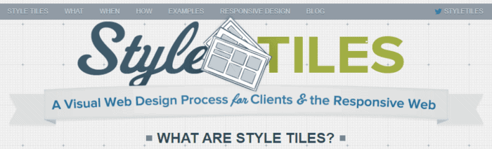

If you are working with several clients and tighter deadlines, Style Tiles can be one of the best responsive web design tools to build and send quick site-idea mock-ups for approval before actually having to do the heavy lifting of design work. There are several free templates you can download for free, created by other designers who know how hectic working with clients can be.
Webflow
This handy responsive website design tool automatically generates the code, so you only need to work on the site’s visual aspects. The company behind the tool offers both free and premium plans for designing responsive layouts. While the free plan has quite a few great features, the premium plans offer even more variety and features.
UXPin
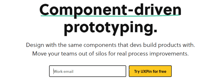

Here’s a great, subscription-based prototyping platform that prioritizes user experience and speeds up the design process with several pre-built components designers can use to spice up their projects. It also has great collaboration features making cross-designer and cross-team work easy.
Responsive Web Design Tools for Testing
The biggest challenge of creating a gorgeous and user-friendly responsive design essentially lies in the testing process. Making a website look gorgeous on every platform is a massive task alone, and testing out every variation and scenario can be even more arduous. There are dozens of resolutions and screen sizes to consider, and having access to all of them for manual testing is not just time-consuming but potentially expensive.
And even though manually testing a responsive design is worth the effort, using testing tools can help to fill in the gaps if necessary.
Responsinator
Another extremely handy (not to mention free) testing tool, where you only need to enter your site’s URL and see how the website looks on a handful of different screen sizes, devices, and orientations. It’s a fast and easy way to get a glimpse into how others see your site.
Google’s Mobile-Friendly Test
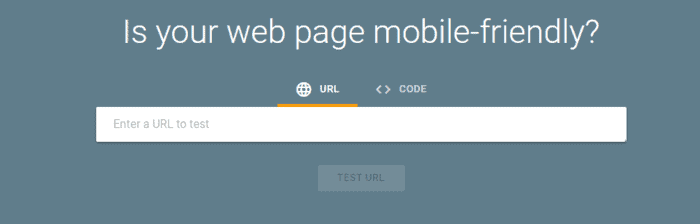
While it’s not a responsive web design tool, this test is pivotal, considering how Google prioritizes the mobile-first approach when it comes to rankings. That said, for anyone who cares about SEO, this tool from Google helps you get instant confirmation of whether your site is up to the standards of the search engine or not.
CrossBrowserTesting
When it comes to responsiveness, most of us will solemnly focus on the different screen sizes and devices we might use to visit a website, and we forget about the different browsers that users use to conduct their searches. CrossBrowserTesting is a handy tool that automates the cross-browser testing process, enabling designers to see if there are any crucial issues present before visitors start to flock to a site.
Resizer
Here’s a free tool that enables designers to see how a website looks on three different screen sizes and lets them test out how their design may look at different widths on different device types. Designers just simply need to click to see how others with different browsers and screen sizes will see the site, enabling them to get a broader view of the potential ways their site can appear to users.
BrowserStack


Geared toward serious designers and companies, this subscription-based tool enables designers to test out their latest designs on nearly every browser type and device (around 2,000 available devices). That said, it’s probably the best responsive web design tool for testing for design companies who don’t want to gamble with possible issues and incompatibilities.
Making Mobile-Friendliness Developer and Designer-Friendly
Creating a responsive website either from scratch or with the use of pre-built elements shouldn’t be rocket science. With the right tools at your fingertips, building a responsive website that meets the standards of modern development and the needs of the users can be a simple process, no matter which device your visitors are using to access your platform.
Hopefully, this comprehensive list is able to help both seasoned and beginner designers to get started on their upcoming projects and will assist them greatly in building a truly gorgeous website that looks stellar on every screen.

