


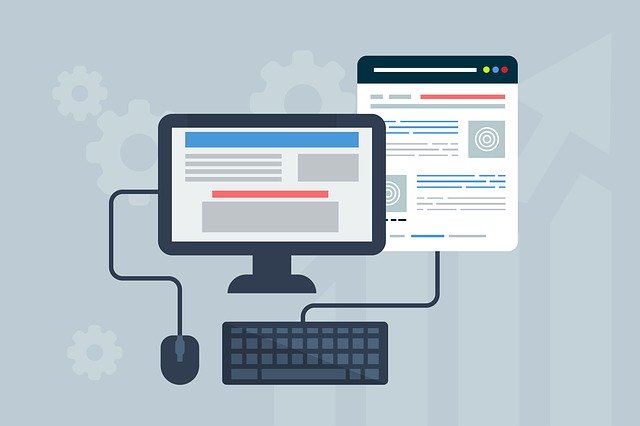
You need your site to be unique and captivating. It has to grab the attention, deliver your message precisely, and maintain the level of your visitors’ satisfaction to encourage them to visit the page again. Many people analyze the latest trends in web design to hit these goals; however, what you may want to examine instead is design theories.
Web design theories strive to explain why some sites are attractive to visitors and others are not. They examine the psychological principles behind consumer behavior, study cases of user interaction with various websites, and synthesize practical tips on how to improve your project. Unlike trends, these theories rarely change over time.

In this article, we’ll take a look at nine web design theories that can help you make your website more appealing and profitable.
1. Speed Is Paramount
The first thing that a user notices about a website is how quickly it loads. People’s attention span, particularly on the Internet, is incredibly short, and it’s vital to generate interest in the first three seconds of a person’s visit. If your page takes a long time to load, a person can decide to go to a different website. Speed is also one of the key factors that determine how likely an individual is to use the site again.
2. The Layout Should Emphasize The Content
The first impression a visitor gets at your website is dictated by the page’s layout. As a rule, large text at the top of the page, surrounded by whitespace, is more visible than a small, low-contrast line surrounded by images. Positions of various elements, such as the company’s logo, are also somewhat fixed in the minds of consumers. Moving these items around for the sake of obtaining a unique look may be counterproductive.
The page’s layout is one of the few areas where experimentation can be hindering rather than enabling. In most cases, it is better to hand the layout design over to professionals. Top design companies know from experience which layouts work and which are likely to fail, depending on your goals and ideas. Read here to learn more about web design services, elements, and processes.
3. Simple Is Better Than Complicated
A minimalistic design does a great job of focusing your audience on the content. It needs to be beautiful but sleek. Avoid multi-column fields, overcrowded areas on the page, and an excessive number of colors. Even if you need flashy and vibrant design, it is better to narrow it down to several prominent elements that will appear consistently across the page rather than introduce your creativity in random explosions.


4. Tall Pages Work Better
No one likes pages that lead into the scrolling abyss. The reason for it, however, is not the length of the page but the time it takes to find information on it. Tall pages that require a lot of scrolling are not evil if you structure them correctly. In fact, they help increase customer satisfaction, since they provide all the answers without requiring the user to click any buttons.
5. Exposed Content Is Better Than Concealed
An average new visitor of your website will skim through the content before deciding whether to move on or stick around. No one will feel inclined to stay if all they see is a plethora of expandable fields and no actual substance. Although it may feel like it simplifies navigation, try to avoid using collapsible lists and menus in the body. Instead, make sure that everything that can encourage a person to read on is clearly visible and accessible.
6. Content Needs To Be Descriptive
Research suggests that 57% of viewing time on a site happens above the “fold.” The fold is the line below which the screen ends, and a person needs to start scrolling to see further content. As a result, if the first thing that a visitor sees on the site is not descriptive enough, the person may stop interacting with the page.
Strive to make your headings on-point, use keywords, and demonstrate your value. Generate the interest above the fold, and place calls to action below it, in places where persuasion is most likely to create demand.
7. Simple Words And Short Paragraphs Work Better
Even specialized websites can be attended by beginners in that field. Avoid using excessively difficult vocabulary and jargon, at least on the front page. Statistically, even highly educated people prefer to read simple, well-written, and precise text on websites. If you must add technical language, make sure the majority of your target audience will understand it.
8. Colors Affect Perception
Colors, by themselves, can signal what type of content a person is viewing, as well as the creator’s intention and mood. Also, changes in color can indicate changes in the subject or page element. For instance, darker colors at the bottom usually mark a footer. If the transition from light to dark hues occurs in the middle of the page, it can make users think they have reached the end and leave.


9. Images Can Help or Hurt
Images are a great way to convey information to your visitors. Photos of people and faces, in particular, can be used to attract attention and point a person’s gaze to the most important elements on the page. However, it’s best to avoid using stock photos. They are generally visibly insincere and hence annoying to the site’s visitors.

