


One popular method for presenting data trends and insights is through data visualizations. They are undoubtedly easier to use than tedious tables and spreadsheets.
Data visualizations give your audience a greater understanding of your data by including color and design components. Data visualization uses charts such as line charts, bar graphs, and pie charts. Inexperienced software developers often find React Native, a JavaScript framework, challenging.
However, creating a pie chart in React Nat is not tricky. Most front-end development frameworks include data visualization libraries for graphing and charting your data in charts, including
- Column
- Bar
- Line
- Area
- Bubble
- Pie
Integrating a framework like React Native with most of the leading data visualization frameworks, such as FusionCharts, is easy.
However, to develop solid charts and provide users with an outstanding experience, you must understand what constitutes a successful data visualization, even if you use FusionCharts.
Simple line charts, column charts, pie charts, and more specialist charts like heatmaps, radar, and stock charts are all available on this platform. Continue reading to see how to make a React pie chart

What Is React Native?
The FusionCharts React Native Component has been redesigned to offer the greatest speed and experience for React Native developers utilizing FusionCharts in their projects.
Additionally, this update fixes a few customer-reported issues with FusionCharts’ rendering in Expo. With FusionCharts 3.18.0 and later, the React Native Component is now available.
Developers may integrate React Native maps and charts to their Android and iOS applications with the React Native component, including area, bar, donut, line, Marimekko, radar, stock charts, and more than 150 additional charts.
In addition, you can develop charts that are responsive to mobile devices, interactive and feature zooming, panning, APIs, animation, drill-downs, real-time updates, and even complete chart and dashboard exporting with FusionCharts’ React Native component.
Additionally, it has event support for touch, swipe, and other actions, allowing you to improve the responsiveness of your charts at any stage of the application’s life cycle. All charts and graphs have also been tested and constructed for millions of data points.
What Is The Difference Between React And React Native?
React is a free and open-source JS tool for building web applications’ user interfaces. It is a set of reusable components assembled to make the program frameworks.
Alternatively, React Native uses declarative components to build complex mobile user experiences while requiring JavaScript.
Using reusable components aids developers in creating native mobile apps. React and React Native are industry leaders and are used widely in web and mobile applications.
React
React is a free JavaScript library for building single-page web apps, sometimes referred to as ReactJS. It is a popular library for making user interfaces for internet and mobile applications. With Facebook’s assistance, it was created in 2011 and has gained popularity.
React also allows for rapid, flexible, and user-friendly development of mobile apps. Additionally, they can have the design process automated. Developers using ReactJS are free to construct anything they want without adhering to strict rules.
For ReactJS developers, integrating libraries or plugins with existing code is trivial. Thanks to it, they can also create simple, scalable, and speedy web programs. With the arrival of React, server-side logic in front-end development is once again available.
React Native
React Native is an open-source JavaScript framework that Facebook developed to meet the demands of its growing mobile audience. You may develop mobile apps from a single code base using the hybrid mobile app technology React Native.
This JavaScript framework makes it possible to build mobile applications that perform flawlessly on iOS and Android. React Native also enables you to create cross-platform software for Windows, Android, and iOS.
Consequently, there is now another framework for building cross-platform apps. React Native uses the core abstraction of ReactJS.
Only the components of the library, though, are special. React JS and React Native are very different but have a similar underlying makeup.
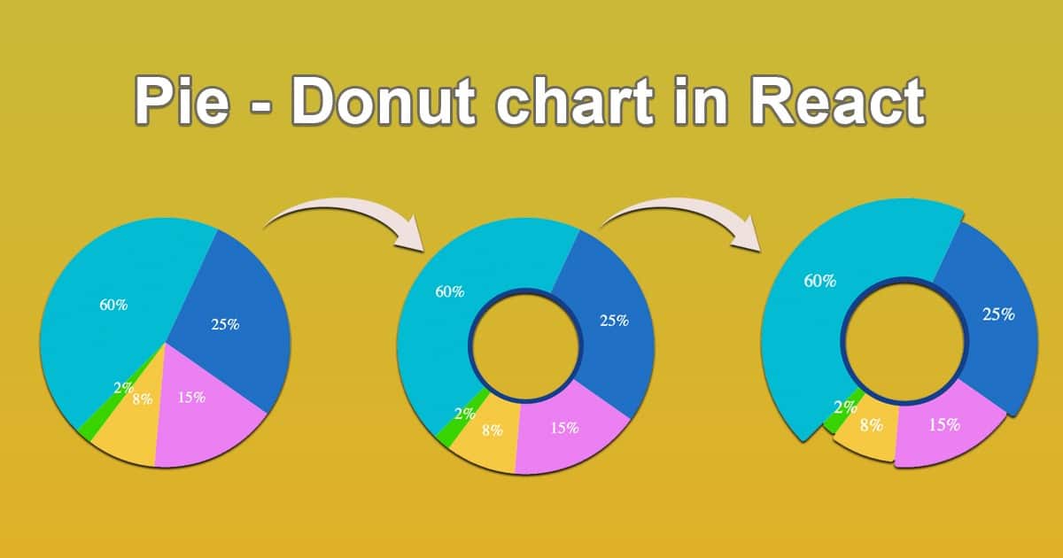
How Do You Make A Pie Chart In React Native?


2D Pie Chart
A whole circle is divided into portions in a 2D pie chart. Each segment represents a percentage of the dataset’s overall value. The graph is a fantastic method to demonstrate complexity.
Accordingly, the arc length on the graph’s circumference is linked inversely to the dependent variable’s size. Slices of the pie are formed by connecting the arcs to the circle’s center via radial lines.
For example, it can indicate a brand’s market share as a percentage of sales in a certain industry.
Sample Code
| import React, { Component } from “react”; import { AppRegistry, StyleSheet, Text, View, Platform } from “react-native”; import FusionCharts from “react-native-fusioncharts”; const dataSource = { chart: { caption: “Market Share of Web Servers”, plottooltext: “<b>$percentValue</b> of web servers run on $label servers”, showlegend: “1”, showpercentvalues: “1”, legendposition: “bottom”, usedataplotcolorforlabels: “1”, theme: “fusion” }, data: [ { label: “Apache”, value: “32647479” }, { label: “Microsoft”, value: “22100932” }, { label: “Zeus”, value: “14376” }, { label: “Other”, value: “18674221” } ] }; export default class App extends Component { constructor(props) { super(props); this.state = dataSource; this.libraryPath = Platform.select({ // Specify fusioncharts.html file location ios: require(“./assets/fusioncharts.html”), android: { uri: “file:///android_asset/fusioncharts.html” } }); } render() { return ( <View style={styles.container}> <Text style={styles.heading}> FusionCharts Integration with React Native </Text> <View style={styles.chartContainer}> <FusionCharts type={this.state.type} width={this.state.width} height={this.state.height} dataFormat={this.state.dataFormat} dataSource={this.state.dataSource} libraryPath={this.libraryPath} // set the libraryPath property /> </View> </View> ); } } const styles = StyleSheet.create({ container: { flex: 1, padding: 10 }, heading: { fontSize: 20, textAlign: “center”, marginBottom: 10 }, chartContainer: { height: 200 } }); |
3D Pie Chart
The pie 3D graphic is also a circle divided into sectors, each representing a proportion of the total values in a dataset. The pie 3D chart improves the visual attractiveness of the basic pie chart by adding depth.
Above all, the graph does a great job of illustrating how the percentage of each part fits into the larger image.
The magnitude of the dependent variable has an inverse relationship with the radius of the arc on the graph’s circumference. Joining the arcs with radial lines gives the circle’s center, which, as a result, splits the pie into segments.
It shows the percentage split or contribution of several variables, like the breakdown of sales by product category or the market share of several brands in a certain industry.

