


In the digital age, a website is often the first point of contact between a business and its potential customers. This makes the design and functionality of a website crucial in creating a lasting impression. Luckily for the website owner, there are a number of design principles that can be implemented to ensure a good experience on the user’s end.
The three foundational principles that can be implemented immediately are a smooth and efficient backend, simplicity, and good color palettes and typography. But first, a brief look at the benefits of good design.
Benefits of Good Design
Whilst the aesthetics of a web page are a significant aspect of its appeal, the benefits of good web design extend far beyond its charm. Web design is about creating an environment where users feel comfortable, informed, and engaged. Good design fosters trust, establishes credibility, and works harmoniously with the goals of the website.
It’s not just about looking good; it’s about providing a seamless, intuitive user experience. Websites that are well-designed see increased traffic, higher conversion rates, and greater customer retention. They communicate messages more effectively and provide a competitive edge in the crowded digital marketplace.
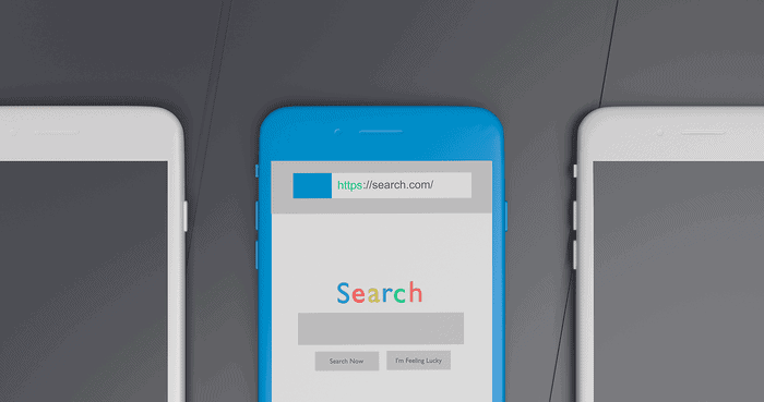
Backend and Search Engine Optimisation
Whilst it is commonly thought that the backend of a website is ‘invisible’ to the user, the smooth functioning, and optimal search engine performance, make it a necessary component of any good user experience.
The development of an effective backend often requires wordpress development skills or other such development tools. These tools allow website designers to embed search engine optimization (SEO) techniques. A well-organized set of SEO techniques not only boosts a website’s online visibility but also its ranking potential, meaning more traffic to the webpage.
With greater traffic to the website and smooth backend functionality, the groundwork is set for a successful website. However, in order to convert that traffic into a successful website, regardless of what success means to you, the webpage needs a well-designed interface. This is where the principle of simplicity enters.

Simplicity
In the world of web design, simplicity is king. A simple design is often more effective, reducing distractions and focusing the user’s attention on what’s important. It’s about stripping away the unnecessary, leaving only what’s essential.
This doesn’t necessarily mean a strict rule of minimalism, it means defining what the focus of the page is and then directing the user’s attention toward whatever that may be. This means avoiding what psychologists call the “paradox of choice”.
This is when, for example, a potential customer ventures to the shops in search of a bottle of hot sauce. But instead of buying a bottle, they are faced with an expansive variety of choices. As a result, they leave the store without making the purchase.
This effect is present in web pages which clutter the interface with too many buttons, drop-down boxes, search bars, and videos. The user will simply leave the site. Alternatively, a well-designed page will focus on a single subject.
This is whatever you want to draw the user’s attention towards. Pair this with a clear way of navigating between pages and instead of leaving the site, the user will be satisfied with their experience on the current page, and curious to see what they can find on other pages.
Color Palette and Typography
So far, the website is smooth and optimized. It has a clear design with a simple navigation feature. Now it is time to express the brand through compelling color palettes and typography.
There are far too many combinations of colours to list, however, there are two important principles to follow. Firstly, keep it consistent and don’t overcomplicate things. Each page should have roughly the same color scheme. There is room to have some diversity, but only change one or two colors between pages. By breaking these patterns, you can draw the user’s attention to the subject of the page.
Secondly, ensure the color scheme is consistent with your brand. If you want to design a happy and welcoming website to advertise homemade lemonade, don’t fill the page with dark reds and browns. Conversely, this color scheme may be perfect for a Halloween event page.


Ultimately, experiment and be creative, but stay true to the brand.
These tips also crossover with the choice of typography. When selecting fonts for a webpage, keep them consistent, unless extenuating a certain point. It is also worth varying the size and boldness of headings – note these headings will influence SEO.
Good web design is much like a well-orchestrated symphony – it brings together various elements in harmony to create a memorable experience for the user. It’s about striking the right balance between functional backend optimization, the clarity of simplicity, and the expressive power of color palettes and typography. All of these principles working in unison will hold the attention and curiosity of any user who finds themself on the page.

